Paul Bacon designed some of the most iconic book covers of all time: Catch-22, One Flew Over The Cuckoo’s Nest, Slaughterhouse-Five, Jaws. Before his death on Monday, at age 91 of a stroke, he dedicated over 50 years of his life to designing covers for over 6,500 books.
To get a better understanding of Bacon’s legacy and influence, I called up Peter Mendelsund. Mendelsund is the associate art director of Alfred A. Knopf and a designer as well; he’s responsible for the covers of a few small books and magazines you may know.
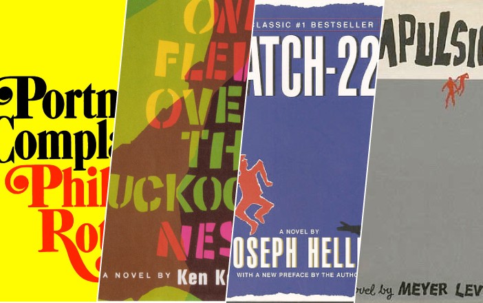
“His great innovation, in a way, was to rearrange the hierarchy of the book jacket,” Mendelsund said. “There was a time when book jackets had to be filled, top to bottom, with realistic illustration. With Paul’s work, the case study is Compulsion, where most of the jacket is blank space, which directs your eye upward towards a really large title. There’s a little spot illustration and the author’s name is smaller. So that hierarchy of information, and his ability to foreground the important fact in a book jacket, is really what made what people now describe as ‘The Big Book Look.’”
“The title’s really huge at the top — it’s unmistakable — and there’s a single, emblematic image, and everything else on the jacket is subservient to those things.”

The same thinking applies to Catch-22: “The title is really huge, and then there’s a little dancing fella. The imagery plays second fiddle to the typography there. He made a choice.”
The challenge of a cover design, he said, isn’t dissimilar to other works of visual art: only so much information can reasonably be foregrounded. “There are only so many things people can see, that will stand out. I think Paul’s contribution was creating a template for us, as jacket designers, as how we stress what we stress. There’s a certain kind of methodology that we employ, conscious or not, when we design a jacket for a book: what’s the most important thing? The author’s name or the title of the book? Sometimes they’re equivalent, sometimes they’re not. If it’s John Grisham’s name, it should be at the top. And there’s this issue of representing the book through imagery.”
“Paul’s work brought into high relief that what we do is create hierarchy. When people talk about the Big Book Look, what they really mean is one element on the jacket is being foregrounded, is really large, and is crying out for your attention.”

In some ways, Bacon’s work was prescient of our modern sensibilities about effective branding. “Sometimes with a jacket, what you’re trying to do is essentially brand the book, as you would a corporation. You find some method, typographic or some emblematic image that will represent that thing. The brands that have survived in corporate culture are simple: they’re easy to remember, they’re eye-catching. So I think he sort of took that manner of thinking — I don’t know that he thought that overtly — but when I look at his jackets, I see that beautiful simplicity.”
Mendelsund couldn’t speak to the degree of autonomy Bacon experienced in his work — whether input from editors, publishers and authors came as requests or demands, or not at all — but “at the end of the day, any design that’s on a book jacket was designed by the designer,” Mendelsund said. “People can direct you in terms of the content of the jacket that you’re making, but at the end of the day, you’re still the one deciding on the colors and cutting the paper and putting pen to paper. It’s the thing you make that makes it beautiful or not. And the cover for Catch-22, if the cover had been done by someone else — for instance, the editor — even with the same parameters, I can see 1,000 ways that could have been screwed up. The jacket is balanced and smart, it’s got that ineffable something that pretty things have.”

“There are facets of his work that are really coming back into vogue now: the Portnoy’s Complaint jacket, you look at the Lena Dunham jacket; they’re kissing cousins. The big serif typography, all type jackets. [We’re seeing] the renaissance of that all-type jacket that he did so beautifully. Look at the cover for One Flew Over the Cuckoo’s Nest, that style of typography, [the] paper cutout kind of thing, that jacket with the stencil: you’re seeing a lot of that stuff, too.”
The collective cultural reverence for the Big Book Look brings to mind ongoing debates about the book covers female authors get: all soft-focus photographs, cursive writing, backs and bare feet. Two years ago, young adult novelist Maureen Johnson started the hashtag #coverflip, challenging followers to reimagining the cover treatment classic works by men would have received if a woman had written them instead. She wrote about the experiment, and the thinking behind it, for the Huffington Post: “The simple fact of the matter is, if you are a female author, you are much more likely to get the package that suggests the book is of a lower perceived quality. Because it’s ‘girly,’ which is somehow inherently different and easier on the palate.”

“There is a ‘serious man’ jacket, and it is definitely one that I think Paul originated,” said Mendelsund. And in Bacon’s day, “this was such a boys’ club generation of fiction publishing. A lot of these writers we’re talking about, it’s Mailer, Vidal, Roth.” (As for the persistence of this gendered packaging, though, he said, “I have no idea why we get stuck in these. It’s completely asinine.”)
“It’s hard to break out of whatever the standard mode of expression is, whatever the cliched mode of expression is. It’s not easy… to do something visually that doesn’t sit inside people’s comfort zone,” said Mendelsund. “And a lot of [Bacon’s] jackets are that, exactly. And they became iconic, but they weren’t that when he first made them. On his desk, in his studio, they were just daring. That’s the part of his work I probably appreciate the most: we think of his name and the Big Book Look, but we don’t remember, there was a moment when it was really, really gutsy to do that.”